Sherwin-Williams Rewild Colourways 2027
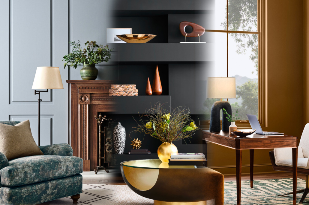
The Sherwin-Williams Rewild Colourways 2027 collection invites you to return to creativity and follow your intuition with colour for creative inspiration within commercial and residential environments. Always innovative, these narratives explore the ideas leading today’s design conversations and shaping tomorrow’s. Every year, designers eagerly await colour trend forecasts for compelling ideas to refresh commercial and residential environments. Explore the wilds of color with a versatile collection of 48 handpicked hues, featuring ten timeless and transcendent Continuity Colors.
Colour is my day-long obsession as an artist and designer. This year, through our Art Marketing Strategist partnership with Quintessance Design, we are especially excited about how these palettes support our creative business development through niche marketing partnerships. I have a photographic memory for colour. I predominantly use Sherwin-Williams paints for my artisan and interior design projects. Their eggshell finish maintains both colour and durability for artisan work. I am inspired by the versatility of these annual colour decks to advance my ideas!
I look forward to these colour stories because their thoughtful narratives and creative writing about the importance of colour across residential and commercial design inspire me to innovate.
REWILD
Sherwin-Williams’ Trendsight Team℠ is a collective of thought leaders and design professionals who combine research, analytics, and diligent trend tracking. They hand-select hues that tell the cultural and emotional stories across every space that touches your life. This year, they invite you to explore the wilds of colour in ways that feel the most expressive, real, and intuitive to you. I am particularly excited by how these 48 handpicked hues can provide the raw materials to inspire you to mix, layer, and create more art-inspired spaces. Explore the wilds of color with their versatile collection of 48 handpicked hues, featuring ten timeless and transcendent Continuity Colours. Sought after by designers, curated by SW’s expert Trendsight Team. They have created a structural framework designed to integrate countless combinations into your design options. These colorways give you the freedom to mix, layer, experiment, and define a palette all your own:
- REVIVE: Much-needed nostalgia and careful craftsmanship are restoring depth and human imprint to the spaces we inhabit. Revive honours the past in the present and reshapes the design conversation. Unapologetic splendor, heritage revival, and timeworn touches are reemerging with quiet authority. In an age of automation, craftsmanship and heirloom sensibility feel both nostalgic and necessary, restoring depth and human imprint to the spaces we inhabit.
- REIGNITE: Chromatic tension, tactile contrast, and a spirit of constructive chaos infuse today’s interiors with distinctive personality and an emotional charge. In a world alight with action and noise, design is rediscovering its spark. Modern design burns with chromatic tension, tactile contrast, and a spirit of constructive chaos. Today’s interiors reject restraint by making room for style that feels emotionally charged and distinctly personal. In this present moment, home becomes both expressive and eternally “us.”
- RECONNECT: Local traditions, ancient wisdom, and deeper ties between humanity and the natural world are helping create spaces for the future that can shelter and support us all. The future of design seeks deeper ties at the intersection of human and nature. Reconnect embodies growing respect for local traditions, ancient wisdom, and experiencing the earth as a living collaborator. The designs of tomorrow feel less imposed upon and more intertwined with the natural world, creating spaces that shelter and support us all.
ART COMMUNITY BUILDING
The importance of colour takes on a whole new meaning with art community building driving commercial design. This is a pet project of mine carried over from when I curated a local art center for three years. I used to watch people wander and gravitate toward certain art styles and colours. Art empowers transformation. It can dramatically alter any space by creating a memorable vibe. Brand identity relies on colour to attract attention and encourage interaction. The synergy of these two opportunities creates diverse avenues to explore.
Colour acts as a shared visual language that unites diverse creators, shapes public spaces, and fosters emotional connections between art communities and local commercial businesses. It’s the one simple thing you can do to make your business a unique place for clients or customers. Our goal is to deepen the connection and brand identity through creative business building. The emotional resonance of warm hues like terracotta and ochre builds feelings of comfort and community warmth. Cool shades promote collective calm in work environments at home or in the office. Building cultural storytelling into your business model gives your brand staying power by connecting it to the local creative community through exploring colour symbolism. Honouring local heritage, reflecting local values, and communicating shared histories develops longevity. Art community building perfectly connects with the innovative narrative of Sherwin-Williams’ Rewild Colourways.