
Rewild Colourways 2027

Sherwin-Williams Rewild Colourways 2027

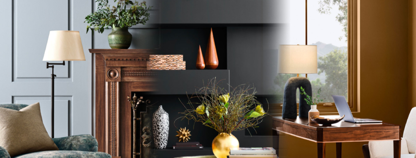
The Sherwin-Williams Rewild Colourways 2027 collection invites you to return to creativity and follow your intuition with colour for creative inspiration within commercial and residential environments. Always innovative, these narratives explore the ideas leading today’s design conversations and shaping tomorrow’s. Every year, designers eagerly await colour trend forecasts for compelling ideas to refresh commercial and residential environments. Explore the wilds of color with a versatile collection of 48 handpicked hues, featuring ten timeless and transcendent Continuity Colors.

Colour is my day-long obsession as an artist and designer. This year, through our Art Marketing Strategist partnership with Quintessance Design, we are especially excited about how these palettes support our creative business development through niche marketing partnerships. I have a photographic memory for colour. I predominantly use Sherwin-Williams paints for my artisan and interior design projects. Their eggshell finish maintains both colour and durability for artisan work. I am inspired by the versatility of these annual colour decks to advance my ideas!

I look forward to these colour stories because their thoughtful narratives and creative writing about the importance of colour across residential and commercial design inspire me to innovate.

REWILD 

Sherwin-Williams’ Trendsight Team is a collective of thought leaders and design professionals who combine research, analytics, and diligent trend tracking. They hand-select hues that tell the cultural and emotional stories across every space that touches your life. This year, they invite you to explore the wilds of colour in ways that feel the most expressive, real, and intuitive to you. I am particularly excited by how these 48 handpicked hues can provide the raw materials to inspire you to mix, layer, and create more art-inspired spaces. Explore the wilds of color with their versatile collection of 48 handpicked hues, featuring ten timeless and transcendent Continuity Colours. Sought after by designers, curated by SW’s expert Trendsight Team. They have created a structural framework designed to integrate countless combinations into your design options. These colorways give you the freedom to mix, layer, experiment, and define a palette all your own:

  • REVIVE: Much-needed nostalgia and careful craftsmanship are restoring depth and human imprint to the spaces we inhabit. Revive honours the past in the present and reshapes the design conversation. Unapologetic splendor, heritage revival, and timeworn touches are reemerging with quiet authority. In an age of automation, craftsmanship and heirloom sensibility feel both nostalgic and necessary, restoring depth and human imprint to the spaces we inhabit.
  • REIGNITE: Chromatic tension, tactile contrast, and a spirit of constructive chaos infuse today’s interiors with distinctive personality and an emotional charge. In a world alight with action and noise, design is rediscovering its spark. Modern design burns with chromatic tension, tactile contrast, and a spirit of constructive chaos. Today’s interiors reject restraint by making room for style that feels emotionally charged and distinctly personal. In this present moment, home becomes both expressive and eternally “us.”
  • RECONNECT: Local traditions, ancient wisdom, and deeper ties between humanity and the natural world are helping create spaces for the future that can shelter and support us all. The future of design seeks deeper ties at the intersection of human and nature. Reconnect embodies growing respect for local traditions, ancient wisdom, and experiencing the earth as a living collaborator. The designs of tomorrow feel less imposed upon and more intertwined with the natural world, creating spaces that shelter and support us all.

ART COMMUNITY BUILDING

The importance of colour takes on a whole new meaning with art community building driving commercial design. This is a pet project of mine carried over from when I curated a local art center for three years. I used to watch people wander and gravitate toward certain art styles and colours. Art empowers transformation. It can dramatically alter any space by creating a memorable vibe. Brand identity relies on colour to attract attention and encourage interaction. The synergy of these two opportunities creates diverse avenues to explore.

Colour acts as a shared visual language that unites diverse creators, shapes public spaces, and fosters emotional connections between art communities and local commercial businesses. It’s the one simple thing you can do to make your business a unique place for clients or customers. Our goal is to deepen the connection and brand identity through creative business building. The emotional resonance of warm hues like terracotta and ochre builds feelings of comfort and community warmth. Cool shades promote collective calm in work environments at home or in the office. Building cultural storytelling into your business model gives your brand staying power by connecting it to the local creative community through exploring colour symbolism. Honouring local heritage, reflecting local values, and communicating shared histories develops longevity. Art community building perfectly connects with the innovative narrative of Sherwin-Williams’ Rewild Colourways.
DOWNLOAD THE REWILD LOOKBOOK!

intentional style

Intentional Style Stories

Building intentional style stories evolves design into a deeper purpose, where every object, texture, and colour choice reflects a personal history, value, or lifestyle. We are expanding b.e.house design as a branded environment consultancy where experiential design meets bold storytelling to evolve your personal or commercial style narrative. We take this evolution personally because branding is an intimate experience.

INTENTIONAL STYLE 

How do personal style narratives create unique environments? Personal style is more than just a mood board and a stack of swatches. It’s a cumulative body of evidence displayed by the way someone moves through a space without thinking about it. This applies to both residential and commercial spaces where brand identity sets intentional style. The curation of objects you’ve kept for decades, the art on the walls, the trips you’ve taken, and even the way you present yourself through fashion have become part of a storyline you never knew existed.

At b.e.house design, we call the practice of translating that evidence into environmental spaces a personal brand narrative. This involves intentional style choices curated for impact. We are crafting feelings into identity, memory into aspiration, and emotional attachment into something tangible. Light, art, fabrics, proportion, interpretive design, and flow build this translational narrative. We’re taking your persona history, values, and taste and converting them into a visual storyline you can experience daily.

HOW IT WORKS

It begins with identity, not inventory. Before any material or layout decision is made, a personal style narrative begins with excavation. What do you value? What stories do you want a room to tell? What do you want to feel the moment you walk in? It’s closer to brand strategy than traditional decorating. We’re defining a style story the same way a brand defines a voice.

Material becomes vocabulary. Every material choice communicates something: warmth, permanence, playfulness, restraint. Someone drawn to craftsmanship might gravitate toward hand-finished wood and visible joinery. Someone who values calm and control might lean into matte, low-contrast palettes. We treat material selection as sentence-building, not trend-following.

Flow becomes emotional pacing. How a homeowner moves through their home mirrors how they want to move through their life. Open, uninterrupted sightlines can signal a desire for spontaneity and connection. Layered, compartmentalized spaces can reflect a need for ritual or focus. We design the sequence of a home — entryway as decompression, kitchen as gathering, bedroom as retreat — not just its individual rooms disconnected from emotion.

Objects stay anchors, not clutter. This is where personal style narrative diverges the most from generic design. Inherited furniture, travel finds, art with a story are treated as anchors we curate around, so the finished space feels authored by the person living in it, not by a generic showroom feeling.

Light and colour become mood infrastructure. Personal style often shows up most clearly in how someone wants to feel at different times of day. We design light temperature, window treatments, and saturation to support real rhythms — energizing where needed, softening where needed — rather than applying one static palette throughout.

EVOLVING THE NARRATIVE

Intentional style creates a living document. Because personal style shifts with new relationships, new careers, new chapters, we design with enough flexibility — neutral architecture and statement-but-swappable pieces — that the story can keep being written without a full renovation every few years.

This is also why a personal style narrative scales. The same methodology that shapes a single homeowner’s living room is the one driving branded environments and destination design in commercial spaces today. When employee retention and customer experience are increasingly tied to how a space feels, the team thrives. It is not just how it looks. It defines the brand story, translating it into a statement that connects with the client through brand identity. It evolves. By allowing the space to reinforce identity over time, you create permanence.

That’s the throughline of this partnership between b.e.house design and Quintessance Design — bringing over ten years of commercial interior design content and a growing design community together around one idea: style, applied with intention, is never just decoration.

It’s identity made spatial.

BUILDING COMMUNITY

OBSESSIONS: Art community building is the hallmark of the beautiful Sessions Arts Club in Clerkenwell Green, London. Very high on my list of inspirational spaces and fine dining art experiences. You will recognize this as an Art Community Building niche market for our partnership with Quintessance Design, because it is a concept that I am intimately acquainted with! I had the seed of this idea for decades and never said a word. I quietly started fishing around on my own in 2013 for architecturally diverse spaces that spoke to me and the visionary concepts I had. Then the brick hit me upside the head because there aren’t any places willing to do this. Never mind enough artists to build this kind of community, and an exceptional chef to make it a destination. I did regional searches again, doing due diligence to flesh out endeavors and independent proposals while seeking art investors as the art gallery went on the market for the final time. Sessions found me during all of this foundation work over 5 years ago! This is an amazing process! But what was I thinking here? A friend of mine then told me that I needed to throw a wider net! Boy, did she hit the nail on the head!! So here I am, throwing the net into creative business development, with more visionary ideas. One thing I know from Sessions is that I was on the right track. My concept is possible. I know it can flourish and inspire people because I experienced it myself. I am seeking innovative thinkers and business owners interested in creating inspired environments so their teams can thrive. Co-creating unique branded environments that showcase the local art community embodies immersion design in a nutshell. London inspired it. I can build it. It will rock the socks off the naysayers! #behousedesign #artlife #designdevelopment #artcommunitybuilding